


Creating a strong and obvious band identity was an important job for all products of this project. The combination of the video, website and album cover worked well in doing this and helped strengthen both the band's style and the artists' individual personas.
- Through the band's costumes in the music video and promotional photos, their style choices are apparent, and because the costumes are so unique, they themselves are something that can be associated with NTLS. We designed Nathan and LuLu's outfits so that the audience see them as interesting and individual, playing on Richard Dyer's star theory to create an image in the audience's eye that they can appeal to.
 |
| [ Click image to enlarge ] |


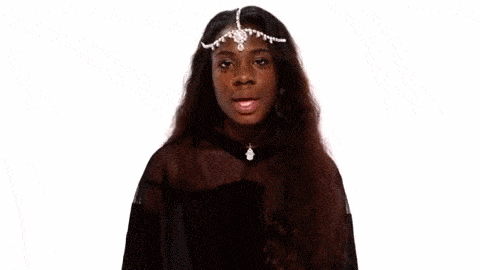
Examples of the face paint pattern both artists wear during the video
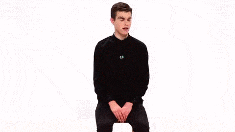
- The artists strange and posed modelling stance creates a surreal and unnatural feel to the photographs, enhanced by the white/black cove behind them. It creates a very stylised look to the artists which immediately connotes maturity and sophistication.

An example of some of the promo shots, also featured on the GALLERY page of the website

PERSONA


- I feel the way in which Nathan and LuLu hold themselves in both the video and photos also accurately reflect the profiles we created for them and give the viewers an idea of their personality. The way in which they move, calm and slowly, creates this cool mysterious aura about their characters.
The artists moving their heads to the side as part of the video choreography
- From social media feeds and what the pair upload, the audience are able to get a feel for what they are like both on and off set. This is where Richard Dyer's Star Theory was referenced by us again, as all updates on social media sites like Twitter, Facebook and Instagram were carefully selected before uploading, sculpting the artist's image in the pubic eye.


The instagram and twitter pages for NTLS looks liked this.
Constant updates throughout the release of the album
(the project) meant audiences were up to date.

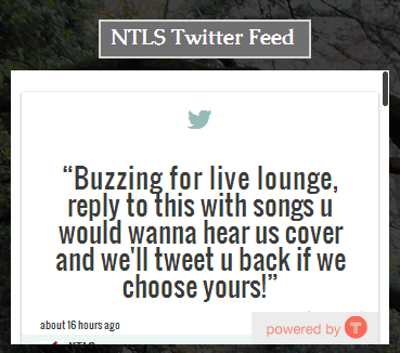
We advertised the release of the website on the twitter page
as a way to encourage audiences to visit it and to potentially
increase sales through the website

BRANDING
CONSISTENT STYLE
- To create a consistent brand we had to create a consistent style so that viewers did not get confused with the what the brands message was. Using the simplicity of the song as a template we went for a really minimalist theme in order to reflect it in the work we created. The video contains simple features, simple movements and simple cuts which create a relaxed feel.
The gallery shows a range of images from the video
with time codes showing the consistency of style in the video
[ Click to images to enlarge ]
[ Click to images to enlarge ]
- The website's features are plain and straightforward but do their job in displaying information, along with with the album cover which is stylised and has very little features but is effective in displaying them. Over the three platforms you see a clear consistency with the way in which the brands information is presented in this minimalist style.

The NTLS Website (top left), video stills (top right) and album cover (bottom)
- After deciding on using the black on white/white on black set ups for the music video, this became a common theme for the rest of the project. The website featured white type on black background along with the NTLS logo being featured as white on black/black on white in various places including the website banner, merchandise and album artwork.

- Having consistent fonts was really important for our website and album cover as it meant that we kept this minimalist approach solid. All pages of the website, including the website's banner use the font Caudex, a plain sans-serif font. The font Penakut is also kept consistent on the album cover also, and we tried to pick one as similar to the handwritten style of the logo to try and keep up this continuity.

- Keeping a consistent layout is also important in order to keep the older audience from getting confused with the message and identity of the brand. The website layout uses all squares and rectangles to focus the viewer on the content. We deliberately didn't use too much colour as that would over complicate the brand which in itself is simple and minimalist.
LOGO SATURATION
Logo saturation is what is used to really hammer home the brand to the viewer and to create something that people immediately associate with NTLS. The NTLS logo appears in various places across the platforms created for the project
ICONOGRAPHY
There were various things that we wanted to create as icons for NTLS that could be easily recognisable as so.
- The graphic seen on the album cover and main page of the site is an iconic image that the audience can associate with NTLS. The dots that make up the face of the two artists merged is quite an original idea and so when the artists became known outside of their fan base, that style would also become something that they would be recognised for, not just their music. This was arranged as a marketing strategy, so that the audience for NTLS would become a lot broader with the NTLS fans promoting the artists.

A basic representation of the process behind creating the NTLS graphic
- When creating the merchandise we had to take into consideration what the target audience would wear and what they like, and so used referencing from artists such as The XX, SBTRKT and Flying Lotus.

We used the logo for NTLS in various graphic ways, enlarging, repeating and rotating the image to make products that were all individual. The logo is what makes the products iconic but the style is what makes them fashionable. The main purpose of the merchandise would be to create something that the audience could buy that in itself promoted the brand further, and in that sense it fulfils its purpose.
SYMBIOTIC RELATIONS
SOCIAL MEDIA
Taking inspiration from other websites such as Lewis Watson and The 1975, we used social media as another way to market our brand and created various pages dedicated to updating followers of NTLS.
- We created and posted regularly on a Twitter account, featuring images and links to other social media platforms such as Instagram. The Twitter feed for the NTLS account was embedded onto the NTLS website in the TOUR section of the website also, allowing the more dedicated fans of the artists to be up to date.


- The Facebook page for the artists was also created, with photos uploaded and links to various sites relating to NTLS being posted.
- Regular updates on the NTLS instagram account throughout the project were shared on the NTLS website also, with a live feed of their instagram page featuring on the GALLERY page of the website.

RADIO
- We decided that we would include an advert featuring the date and time fans could tune in to NTLS on BBC Radio 1, a radio station that regularly features electronic indie artists. This was to broaden our reach and to market the release of the album, due to the large numbers of listeners BBC Radio 1 has. We also advertised this on our twitter account also, so fans following the twitter page could share the post so that it gained publicity

No comments:
Post a Comment