My three media products from this project use, develop and challenge the forms and conventions of real media products in a number of ways. All three platforms use very different methods of communicating information to the audience, much like the professional examples used to influence this project, and so I will analyse each product individually, using references to the other platforms where necessary.
REPRESENTATION
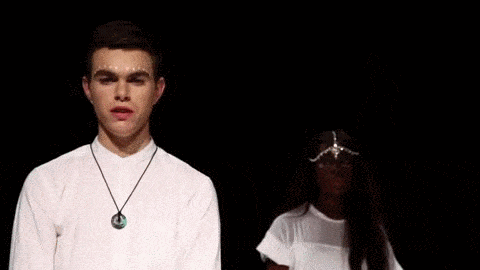
- Neither artist is more prominent than the other, regardless of race or sex. We chose to represent the characters as equal in order to appeal to a wider audience, as none of these factors affect status in today's society. Conventions are challenged by the fact that usually there is a clear lead figure in a band and we don't have one, however we felt we were building on the idea of having a lead figure in the first place, which in turn is the development in the way artists are represented.

As you can see, both artists get the same
amount of screen time as each other.


Both artists are fully covered and dressed stylishly.

Almost exactly the same framing for each artist, from
the same angle and for the same period of time
the same angle and for the same period of time
During the research and planning stages of the project we looked to Andrew Goodwin's theory for music videos. Goodwin states that music videos demonstrate characteristics typical of their genre. By following genre conventions, the audience will be able to recognise and relate to the video, meaning they will enjoy watching it more.
Influenced by artists such as AlunaGeorge, FKA Twigs, Banks and Gold Panda, we looked at the common conventions in their videos and decided on whether or not to conform to them.
ICONOGRAPHY AND VISUAL HOOKS
- We used Strauss' Binary opposites theory with the narrative, seen in both the studio and on the VHS footage, to create some aesthetic the audience could appeal to. The black an white contrasting imagery from the studio shots was visually striking and stylistically appealing to viewers.

There is a contrast between the crisp
HD footage and the grainy VHS footage


Here we see two of the same shots, both
repeated in black and white setups
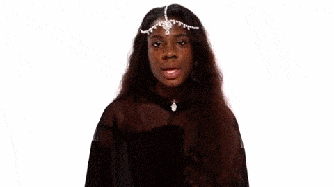
- Strongly influenced by Richard Dyer's media theory involving the construction of a star's image, we created a whole profile for our artists, heavily focusing on their persona, style and characteristics. The group felt it was vital that the artists' image had to be as strong as possible, not only to engage the audience during the video but also so that it made creating a consistent band image easier overall. Influenced by the likes of AlunaGeorge and FKA Twigs, we designed their image around what would appeal to our target audience.


FKA Twigs influenced the way in which our
artists dressed and their outlandish fashion senses.


AlunaGeorge helped in strengthening an artist's
image using a male and female duo. It was also coincidence
that they were a white male and black female act.
- Goodwin states that 'the demand of the record label will include the need for lots of close-ups of the artist and the artists may develop a visual which recurs across their work'. Taking into account Goodwin's theory, we included a lot of close ups of the artists, and used the artists' style to create an iconic image instantly recognisable as NTLS.

Here is a series of close ups of both artists from
the 'Heart Skipped a Beat' music video
INTERTEXTUAL REFERENCING
Here is a mind map showing how we used intertextual referencing in the video for 'Heart Skipped a Beat'
PERFORMANCE AND NARRATIVE
- Our music video is a combination of both narrative and performance. We decided to have half of the video as narrative, and half as performance in order to make sure that the band image was clearly conveyed, whilst the message of the song was also apparent through the narrative flow. We drew inspiration from 'Just a Touch' by AlunaGeorge in terms of the performance side of our video however, with the narrative scenes we used references such as 'Call Me Out' by JUCE and Blind Faith by Chase & Status.


Scenes from Chase & Status - Blind Faith ft. Liam Bailey (Left) and JUCE - Call You Out (Right)


Scenes from the music video 'Heart Skipped a Beat' by NTLS
- Strauss' theory of binary opposites also came into play with how entertaining and engaging the narrative was. We used contrasting emotions of happy and sad; happy when the audience see the couple having fun and sad when the couple break up. We felt that building up the relationship between the two characters and allowing the audience to see their development over the course of the video allowed them to empathise or sympathise when the couple broke up.
LYRICS, MUSIC AND VISUALS
- The idea behind the video itself came from the lyrics of the song when we listened to it, so it was always relevant in our planning of the project. Vivian had the idea to use a duet singing to each other and have VHS footage of the duet from their relationship and the idea developed from there, with lyrics such as 'please don't say we're done when I'm not finished' and 'The more I see, I understand
But sometimes, I still need you' strengthening the idea of a discussion between two ex lovers. In learning about Goodwin's theory of how music videos link lyrics and visuals, we took influence from videos such as Flying Lotus - Never Catch Me ft. Kendrick Lamar and Sam Smith - I'm Not The Only One as both are videos where the lyrics directly link to the visuals of the video.
- Carol Vernallis' theory into how the beat and rhythm of a song is used in relation to the visuals was also useful in the way we shot our studio footage. Examples such as the turning of the head to the beat or blinking in time with the music was part of our choreography for the video. We were also inspired by Hotchip - Ready For the Floor where the choreography also matches the timings in the song.
EDITING
- Vernallis states that a music video generally breaks the conventions of continuity editing. The editing should reflect that of the music, and should have a style unique to the track. This is noticeable in the NTLS - Heart Skipped a Beat track where the editing of the video is either synced to the beats or lyrics in the song, creating a clear link between the two. We used a number of editing techniques to relate to the visuals in both the narrative sections and studio sections of the video.

In the video, we made it so that the blinking of the artists was in sync with the track as well as the cutting between tracks
The video continuously breaks the 30 degree rule, has graphic mismatches and extreme changes in the pace of editing which are intended to entertain the audience in an otherwise dull setting.
- We felt the Strauss and his theory of binary opposites was also relevant at this point, where the change from HD to VHS and back is striking and engaging to the viewer.
CAMERA FRAMING AND MOVEMENT
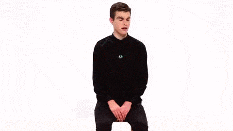
- Neither putting artists in a position of power or vulnerability, face on an at eye level creates a feeing of neutrality with the audience. Other videos use this as a way to empower the artist, and it is predominantly linked with the sexualisation of the artist also. The artist present in the video are displayed as non-sexualised in the way the camera is positioned at eye level.

All shots of both artists are framed the same as each other as much as possible in the music video
- Establishing shots are one of the key features of a music video Vernallis states, along with close us shots. The style of framing should be distinctive to the video, and extreme shots or master shots are common. We use a number of shots in our NTLS music video, with the basis of our video being an ELS of the duo.

A slideshow of the variation of framing seen in NTLS 'Heart Skipped a Beat' music video
WEBSITE
NAVIGATION
We thought that the way in which the audience see and navigate through our website should be easy and straightforward. As our band's image was quite minimalist, this made the job of designing the layout of features easier. We chose to go for a straight forward banner with clickable links to other pages such as the NTLS or TOUR page titles, as this feature was noticeable in most artist websites such as Lewis Watson's or Dog is Dead's websites, and we preferred it to the scrolling blog format both on SBTRKT's and George Ezra's websites.


The straight forward banners we took influence from were a lot more crisp and easy to navigate


The scrolling websites did look nice but were a bit too complex
and it was much more simple to use the more traditional layout
SOCIAL INTERACTIVITY
 With literally every website we looked at when researching ideas for the website, we noticed all of them had a wide range of social media links available on all pages of the website. We decided that similar to Lewis Watson's and The 1975's we would include social media links on our main website banner allowing for easier access and increased audience interactivity with the artist.
The icons and links on the website are direct links to their social media pages
We covered all the major social media platforms including Twitter, Facebook and Instagram, and updated all of the pages as regularly as possible over the course of the project. On top of the main social media links, we also recognised having a mailing list was a common feature of most websites, and dedicated a section of the CONTACT US page of the NTLS website to this, much like James Blake's website.

The main banner to the website. Links to social media and navigation bar are seen here

After clicking on the social media links, it will take you to that
page where you can view tweets or instagram photos for example

The contact us page from the webiste
With Red Pigeon Records being the record label NTLS were signed to, we included a copyright in the footer for the website visible on all pages. There was also contact information available in the CONTACT US page, with a map showing the Red Pigeon Record London offices on and a company email also.

SYNERGISTIC ARTIST / BRAND IMAGE
ALBUM ART
SYNERGISTIC ARTIST IMAGE
The album cover is what ties all three platforms together. As the debut album, we wanted every other product to revolve around the album cover in order to create a brand that the audience could associate with the album itself. The artwork featured on the front cover also features on the main page of the site, with the image used for the outside panel also being the background from the website. On the inside we see a picture of the artists from the photo shoot on the set of 'Heart Skipped a Beat' and next to that, the NTLS logo. The back cover of the album has a link to the website in the form of a readable url but also a scannable QR code so that fans of the artist can easily access information about the artists on the website.